How to combine illustration and photography for B2B technology brands
Choose between illustration vs photography for B2B SaaS. Learn when to simplify concepts or build trust with the right visuals.

Humans are innately visual creatures. In fact, sources report that between 65-80% of the population are visual learners, which means your visitors are already primed to make judgements through images before they read a word. Research shows that we can process a visual scene in just 13 milliseconds, which is about the same time as it takes you to blink. It's therefore in our very nature to make snap judgements as we assess the scenes in front of us. Branding is no different.
In this article we focus on a question most B2B brands face: how do you combine illustration and photography effectively? Knowing which medium to reach for, and when, is one of the cleaner tests of whether a design team actually understands your product.
At Overpass we have worked with 60+ B2B SaaS startups and seen both mediums used well, and used badly. Here is what the patterns look like.
When you want to simplify: reach for illustration
A good graphic design illustration gives us a great way to visualise lots of information quickly and engagingly, and should be used when you have products or experiences that would otherwise need wordy explanations.
Some products simply cannot be photographed. Tokenisation of real-world assets. AI-powered waste management systems. Cold outreach orchestration software. These are concepts that live in logic, not in physical space, so a camera cannot do the explaining.
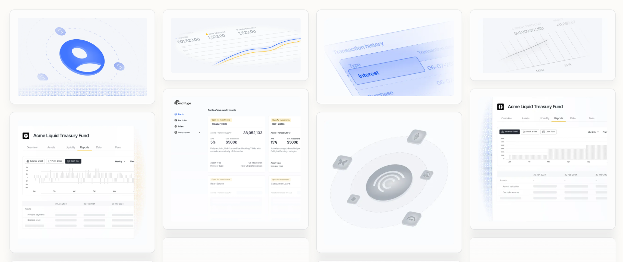
When Centrifuge came to us post-Series A ($15M raised), they had a website that described their product but did not show it. Tokenisation of real-world assets is not the world's easiest concept for a new visitor to grasp. We spent three months redesigning the website with stylised product shots and illustrated diagrams that made the abstract concrete. Visitors did not need to understand the mechanics of tokenisation to understand what Centrifuge did for them.
If your product is similarly complex to explain visually, our product shot service converts screenshots into on-brand stylised or illustrated product visuals within five days, no website rebuild required.
One good example of playful illustration and character illustration done well for B2B is Commsor Mac Reddin from Commsor said after we delivered their brand: "Our CMO described it like someone truly knew our brand."
The greatest strength of a blank page is its possibilities. Not bound by reality or by the logistics of photography, illustrators have the scope to bring your wildest ideas to life. Character design, colour choices, lighting; all within the illustrator's control, unconstrained by what a camera can capture. However abstract or however ambitious, a good illustrator can capture more in a drawing than a photographer can with a photograph.
When you want to build trust: reach for photography
If illustration is the tool for concepts, photography is the tool for proof.
Audiences are drawn to human stories, they want to connect with the brands they do business with and they want to feel like they are part of the story. Photography gives you the chance to share the characters and personalities that will resonate with your audience and reflect your brand's personality.
Consumers are naturally curious, they want to know what they're getting and who they're getting it from. Actual photographs give a consumer that 'what you see is what you get' reassurance and instil trust in a way other mediums can't. They convey emotions and a sense of authenticity that no stock image can replicate.
Photography is particularly effective when you have physical products or real-world environments to showcase. The moment a visitor wonders whether a company is real, photography earns its keep; real people, real spaces, real environments.
For PepperHQ, a hospitality fintech SaaS that has been with us across branding, fundraising, product, and website work, photography grounds a product that could easily feel abstract. PepperHQ operates in the physical world of restaurants and bars. Showing that world builds the case before a word of copy is read. Don't forget your customers either. Nothing instils faith like a good testimonial.
If you reach for photography too early, you may end up with a founder who does not want to appear on camera, a product still in beta with no real environment to photograph, a team of three people who look awkward in posed shots.
The result is overproduced imagery that feels aspirational-but-hollow. Or worse, you delay the website by six weeks because the photo shoot (location, lighting, models) keeps getting rescheduled.
What photography means for SaaS
Photography & videography for SaaS means:
- Establishing trust and credibility with high quality team photography
- Recording high quality testimonials and featuring high quality images of your customers and audience that don't just feel like stock
- Capturing your workspace, culture, and the people behind the product, so visitors see a real company with real people in it
- Filming founder or customer led video that puts a voice and a face to the brand, rather than just words on a page
- Showing your product in the hands of real users, in real settings (a restaurant, a warehouse, an office) wherever your customers actually operate
- Documenting events, launches, and behind the scenes moments that a stock library or an illustrator simply cannot fabricate
None of this replaces your product shots. It sits alongside them. Product visuals do the explaining, photography and video do the convincing. A visitor who understands what your software does still needs a reason to believe the company behind it is real, credible, and worth trusting with their budget. That reason rarely comes from the interface. It comes from the people.
For SaaS leaders, the practical takeaway is to think of photography and videography as your proof layer, not your product layer. Invest in it wherever your brand needs a human face: team pages, about pages, case studies, testimonials, and social proof. Save the product explaining for illustration and stylised product shots instead.
Where do SaaS product shots live: illustration or photography?
Done well, SaaS product shots actually sit closer to illustration than photography. A raw screenshot is not a photograph of anything real in the physical sense, it is an interface, and turning that interface into a stylised, illustrated, or simplified visual (using real UI, then reframed, cleaned up, and rebuilt with illustrative elements) is exactly the kind of creative interpretation illustration is good at.
It gives you the flexibility to highlight a feature, simplify a busy screen, or communicate something the interface alone cannot, in a way a straight screenshot never could.
The exception is when product shots are built as photorealistic mockups, screens placed into realistic device frames or environments designed to look and feel like an actual photograph. That treatment borrows the trust signal of photography: it says "this is a real, tangible product," in the same way a photo of a physical object would.
Most SaaS product visuals sit somewhere between the two, leaning illustrative for clarity and only pushing toward photorealism when the goal is specifically to prove the product is real and polished.
For SaaS leaders, the practical takeaway is to think about intent first. If you need to simplify or explain a feature, treat your product shots as illustration. If you need to build trust and prove the product exists and works, lean into the photorealistic, device framed treatment instead.
Investing in a consistent set of on-brand UI visuals (for your website, decks, sales pages, and ads) is one of the clearest ways to build trust, reduce perceived risk, and make it obvious that what you're selling is a real product that people can start using today.
Explore our product shot services
The choice is not about style. It is about function.
Brands that mix illustration and photography well are doing it deliberately. The two mediums each carry a distinct message, and consistency across both is what builds a brand identity that works at every touchpoint. Illustration for the "how it works" section, photography for the "who we are" section. Illustration in the product UI, photography on the about page.
What causes problems is defaulting. Reaching for stock photos over custom illustrations because it is cheaper, and skipping the photography that would build credibility. Or spending on a photo shoot when the product concept still needs drawn diagrams to bring your ideas across.
For Caide, a sales intelligence platform targeting cold outreach, we ran through three brand routes with founder Seb Vissers. The decision was not a graphic design choice. It was about what stage of the buying decision their site needed to support. Were visitors arriving already understanding the category, or did they need to be brought in from scratch?
The same question applies to any B2B brand. Before you brief a photographer or an illustrator, ask what message that visual needs to carry. Simplifying a concept? Illustration. Building human trust? Photography. Showing a product in use in the real world? Probably both. Each medium tells a different part of the story.
If you need consistent branded content across every channel without building an internal design team, our content design subscription gives you a senior fractional team covering ads, decks, social templates, and website assets from £3,600 a month.
A quick example: Etsy
No one exemplifies a thought-out, clever combination of illustration and photography like Etsy.
Etsy's visual language has shifted over the years in a way that makes the logic clear.
The earlier version of the brand leaned on photography of real makers and their materials. Hands on clay. Thread on a loom. That photography was doing a storytelling job as much as a trust one: proving these are real people making real things, and that the illustrated world of Etsy's marketing connects to actual, physical craft.
As the platform scaled, Etsy layered in illustrated elements for marketing and seasonal campaigns. Not to replace the photography, but to carry a different message: communicating values, seasonal themes, and brand personality that photography cannot flex to cover quickly or cheaply. An engaging illustration campaign can be turned around far faster than a photo shoot, and the consistency of that output is something this article returns to throughout. You cannot photograph "Christmas spirit" in a way that refreshes every year without a significant production budget.
The two mediums coexist because they are not solving the same problem. Photography grounds the work in realism. Illustration handles imagination. Together they create a distinctive brand identity that neither medium achieves alone, and the brands that understand this create a visual system with staying power.
The practical questions
When a new client brings us a brief at Overpass, we ask two things early on.
- First: does your audience need to understand what you do, or do they already understand the category and just need to trust you? The emotions you want to create in a visitor (curiosity, confidence, recognition) depend on the answer. Stock images rarely create any of those. If the answer is "understand," illustration usually leads. If the answer is "trust," photography leads.
- Second: does your product exist yet in a form that can honestly be shown? If it does not, illustration is often the only truthful option.
Getting this wrong is not just a visual problem. It is a communication problem with real commercial consequences. If you are spending budget on photography for a concept your customers have not yet grasped, the photos become expensive decoration. Every brand has a story to tell, and mismatched visuals tell the wrong one. Visitors leave without understanding the product, and the conversion numbers reflect it.
If you are using illustration for a product people could simply see in action, you are introducing abstraction where clarity was available.
Combining illustration and photography well is a communication decision, not a style preference. The visuals follow the argument, not the other way around.
We're moving through an increasingly visual world. Our screens are more immersive and our brains are becoming hard-wired to seek out the visual aspects. To be truly unique, we need to keep in mind how different visuals make us feel and when to use them.
If you have worked out how illustration and photography should work together for your brand, here is where to start.
- If your product is complex to explain visually. Our product shot service takes a screenshot and returns a stylised, illustrated, or contextual product visual in five days, from £250 per shot. Stylised shots simplify a complex screen so visitors grasp the value immediately. Illustrative shots communicate features that have no specific screen at all.
- If you need ongoing branded content across multiple channels. Our content design subscription gives you a senior B2B design team, covering paid ads, sales and fundraising decks, social templates, event print, and website assets, for less than the cost of a junior hire, from £3,600 a month. Flex up or down as workload changes.
If you need some guidance, feel free to reach out. We'd love to help.
Get in touch


![6 Best Webflow Agencies For B2B SaaS [With Reviews]](https://cdn.prod.website-files.com/63f4f8b3637ca34b3b597dcd/6972206f4a7f922c730f7b66_max-brown.avif)