Roundup: 7 Best B2B Branding Examples & Why They Work
Discover 7 SaaS branding examples that turn sharp strategy into memorable design across product, decks, social, sub‑brands and more.

Successful brand examples for SaaS don’t just look good, they turn sharp commercial thinking into a distinct creative point of view that people actually remember. They behave like products in their own right: built on clear logic, designed for usability, and robust enough to show up consistently across every touchpoint, from investor decks and social posts to product UI and spin-off sub‑brands, without ever losing their core personality.
This article unpacks eight top SaaS branding examples that put that idea into practice, spanning MVP brands, visual identities, paid media, design systems, pitch decks, sub‑brands, social templates and brand territories, and highlights the specific moves any growing SaaS team can borrow.
Like our work? Book a free brand design day
7 Best SaaS & B2B Branding Examples & Why They Work
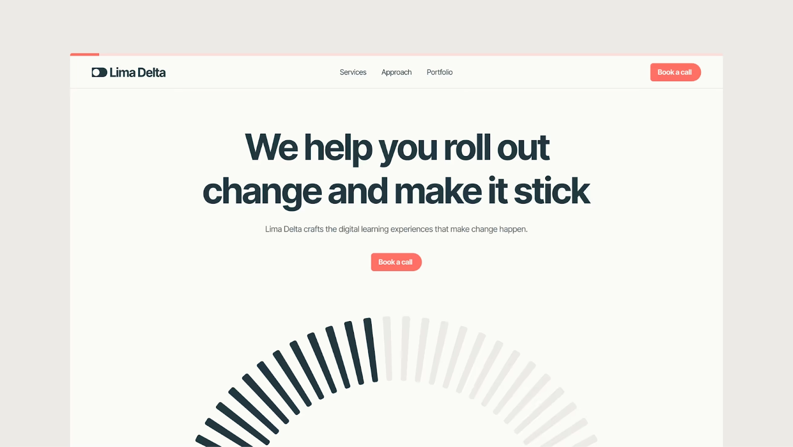
Visual brand identity: Lima Delta
B2B agency Lima Delta is a masterclass in using visual brand design to escape the sea of “smart, strategic, digital learning” sameness. Rather than decorating a pre-written story, Overpass started by excavating the real brand essence: what motivates customers, what the team genuinely does differently, and how the business model diverges from better-known competitors.
That thinking fed directly into a sharper verbal identity and a microsite that finally sounds like Lima Delta, not generic L&D speak. Visually, the Lima Delta brand leans into its name and narrative as a design asset, creating a distinctive, confident presence that feels more like a partner in performance than a content vendor.
The result is a lean but high-impact microsite that attracts both clients and talent, proving that in B2B services, the job of branding is less “looking pretty” and more “making the value and difference impossible to ignore.”
Paid ads: TOPANGA
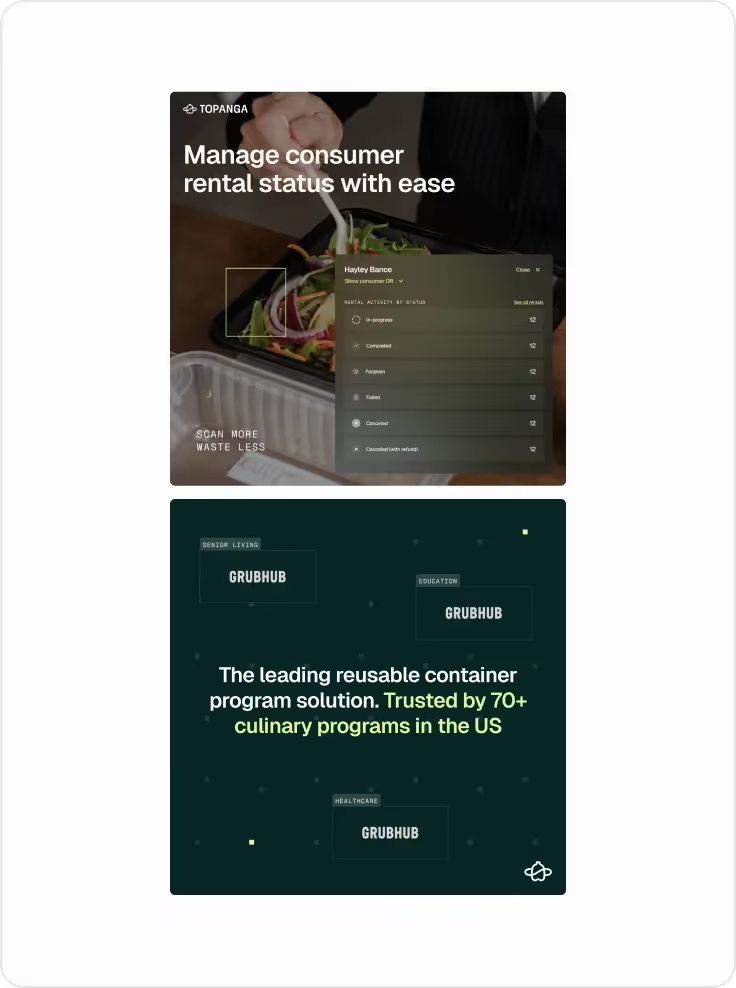
TOPANGA sits in the sweet spot between high-performance ads and a high-conviction brand. The interesting move is treating ad creative like a rapid-testing lab for the broader brand story. Messaging, value props and visual treatments are cycled through paid channels first, then the learnings can inform website, product marketing and even positioning.
TOPANGA proves that “unsexy” foodservice software can look aspirational, with ads that feel like brand campaigns while still leading with clear product outcomes such as container returns, waste reduction, and cost savings. It demonstrates how to anchor creative in specific operational wins so ads stay conversion-focused without resorting to generic B2B tropes.
Design system refresh: Commsor
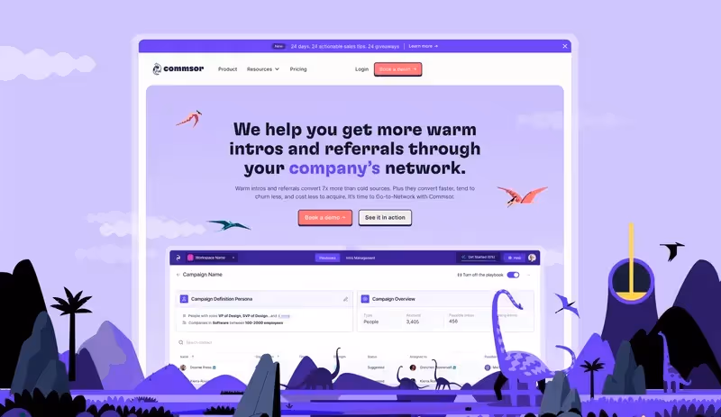
Commsor demonstrates how a design system “refresh” can be more transformative than a ground‑up rebrand. The brief was to keep the much‑loved core brand, but rebuild the site so it actually behaved like the product: clear, powerful and surprisingly fun. Overpass responded by taking over the website for six months, prioritising pages, and rebuilding UX and UI around clarity of offer, performance and a more robust Webflow implementation.
The strategic unlock was a new design system that allowed the team to ship new product, use case and methodology pages at speed without sacrificing consistency. By threading in playful references to retro games, sci‑fi and even Jurassic Park, the site amplifies Commsor’s personality instead of sanding it down for the sake of “enterprise respectability.”
It’s a strong example of a SaaS brand as a living system: the more well-designed pages you launch, the stronger and more coherent the brand actually feels.
Pitch decks: Pepper 2.0
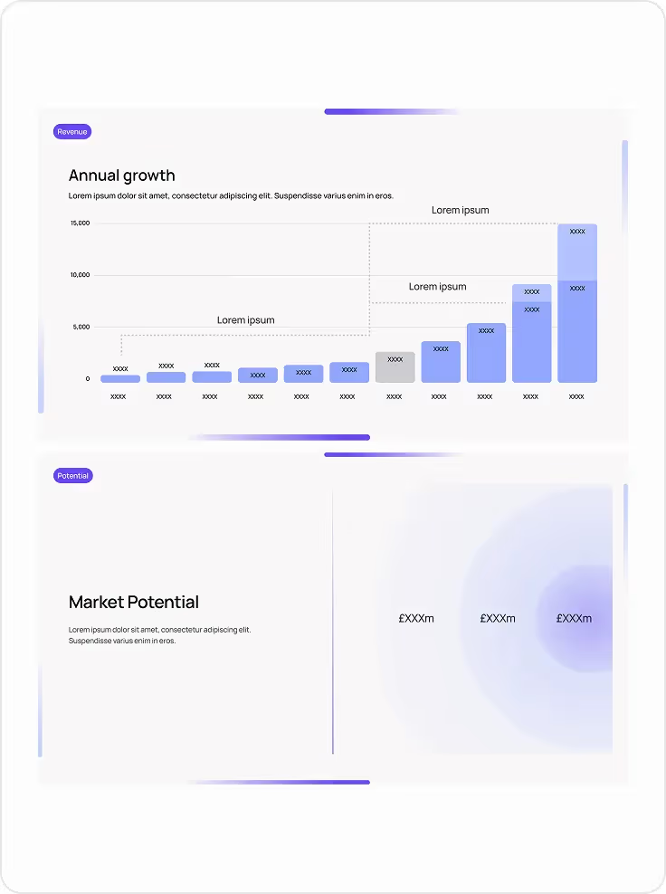
Pepper 2.0’s pitch decks take the calm confidence of the new brand and weaponise it for storytelling. The slides use a restrained, spacious layout with soft gradients and clear axis labelling so revenue growth and market potential feel both impressive and believable, not shouty. The typographic hierarchy keeps headlines like “Annual growth” and “Market potential” doing the heavy lifting, while supporting copy stays intentionally minimal so founders can narrate the story in the room rather than read from the screen.
What really works is how the design system turns dry metrics into an elegant narrative arc. Consistent colour roles (e.g. a single accent for key bars and callouts), repeated card-style modules, and generous white space create a rhythm that makes complex numbers easy to follow slide after slide.
For SaaS teams, this is a smart blueprint: design decks as an extension of the product brand, where every chart, gradient and margin is in service of one idea—this company understands its numbers, its market, and how to communicate both with grown-up clarity.
Sub-brand strategy & design: QuickPay
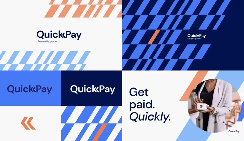
QuickPay is a sharp example of a SaaS sub‑brand that borrows equity from its parent (Pepper) without becoming a visual clone. The challenge was to create something that felt unmistakably “Pepper” but had its own fizz: a distinct colour story, geometric design language and a landing experience that feels like a product launch, not an ancillary feature page. All of this happened under serious time pressure, using a sprint model that delivered an MVP brand and live no‑code landing page in a couple of weeks.
From a SaaS branding standpoint, QuickPay nails three things: fast but focused strategy, a visual system that can scale across marketing assets, and copy that carries a clear verbal identity rather than generic fintech jargon.
The outcome is an experience that’s bold enough to turn heads in a crowded payments space while still feeling part of the Pepper universe – exactly what you want from a product-led sub‑brand designed to drive rapid adoption.
Social templates: Adapt Unbound
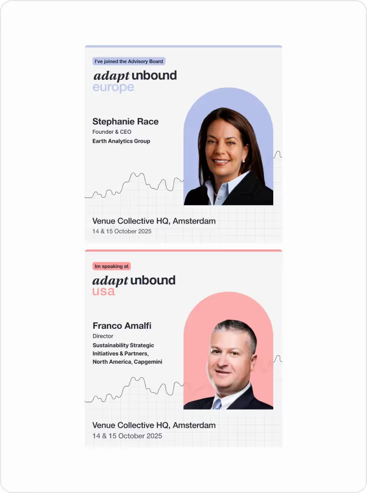
B2B events company Adapt Unbound’s social templates show how to turn event comms into a coherent, instantly recognisable mini‑brand. Each speaker card uses a tight grid, a consistent typographic system and subtle line graphs in the background to nod to data and progress without overwhelming the content. The colour‑coding of “Europe” and “USA” creates a simple but powerful system: audiences can scan the feed and immediately understand what’s relevant to them, while the event brand feels global, organised and in control.
The real strength is how human the templates feel. Photography is framed within soft geometric shapes, balancing authority with warmth, and taglines like “I’ve joined the Advisory Board” or “I’m speaking at” are treated as bold status signals, not afterthoughts.
It’s a reminder that in B2B events, social design’s job isn’t just to “on-brand the assets” – it’s to make speakers proud to share, and to turn every post into social proof that the right people are in the room.
Brand territory designs: Caide
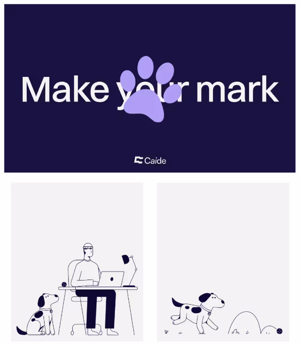
Caide’s brand territories use a simple idea – a person and their dog – to carve out a distinctive emotional space in a crowded tech landscape. The illustrations are ultra‑minimal, built from clean lines and a restrained palette, but they sit against a deep, confident brand colour and a bold line like “Make your mark,” giving the whole identity a sense of purpose and charm rather than cuteness for its own sake. The oversized paw mark breaking the headline is a smart, ownable gesture: playful enough to be memorable, but executed with the precision of a serious SaaS brand.
What makes these territories powerful is how adaptable they are. The character-and-dog duo can flex across stories – focus at the desk, movement and momentum, curiosity and play – giving Caide a toolkit for everything from product explainers to employer brand without ever losing recognisability.
It is a neat demonstration that the strongest SaaS branding often comes from one sharp, flexible visual metaphor, rigorously applied, rather than a bloated library of interchangeable “on-brand” scenes.
What the best B2B branding examples get right
The strongest SaaS and B2B brands in this roundup all blend clear commercial logic with an ownable creative idea that actually earns attention. They treat their brand as a system that can flex across touchpoints – from decks and social to product UI and sub‑brands – without losing its core character.
Work with our expert designers to level up your B2B or SaaS brand
At Overpass Studio, you can work with our expert designers for a fixed monthly cost. Working alongside B2B SaaS and digital product teams, we design brands and websites that stand out in the market, scale with ease, and sell software like hotcakes. Subscribe to a fractional design team to level up your website, brand and marketing material on an ongoing basis. Starting from £1,950 per month.
Book a free design day
Effective SaaS Branding Examples FAQs
What features do SaaS companies use in branding?
SaaS businesses rely on distinct visual systems (logo, colour, typography, UI style) plus a consistent brand personality across websites, dashboards, and SaaS marketing strategies to signal reliability, innovation, or simplicity. They also use clear value propositions, customer stories, and focused SaaS marketing campaigns to explain complex SaaS products in simple, outcome‑driven language that builds trust and brand loyalty.
What is the target audience for SaaS branding?
The target audience for SaaS branding usually includes specific roles or teams (for example, founders, marketers, product managers, HR, finance) with a shared problem and buying power, rather than a broad consumer mass market. Effective SaaS branding strategy segments these potential customers by use case, company size, and maturity level so messaging, visuals, and pricing all feel tailored and relevant.
How do SaaS businesses design a strong brand?
Successful SaaS brands create strong branding by defining positioning: the problem solved, the unique approach, and why it is better than alternatives, then translating this into a simple narrative and brand personality that everyone can repeat. From there, teams create a visual identity system, messaging guidelines, and reusable marketing materials so designers, marketers, and product teams can execute SaaS marketing consistently across website, app, and campaigns.
Get in touch