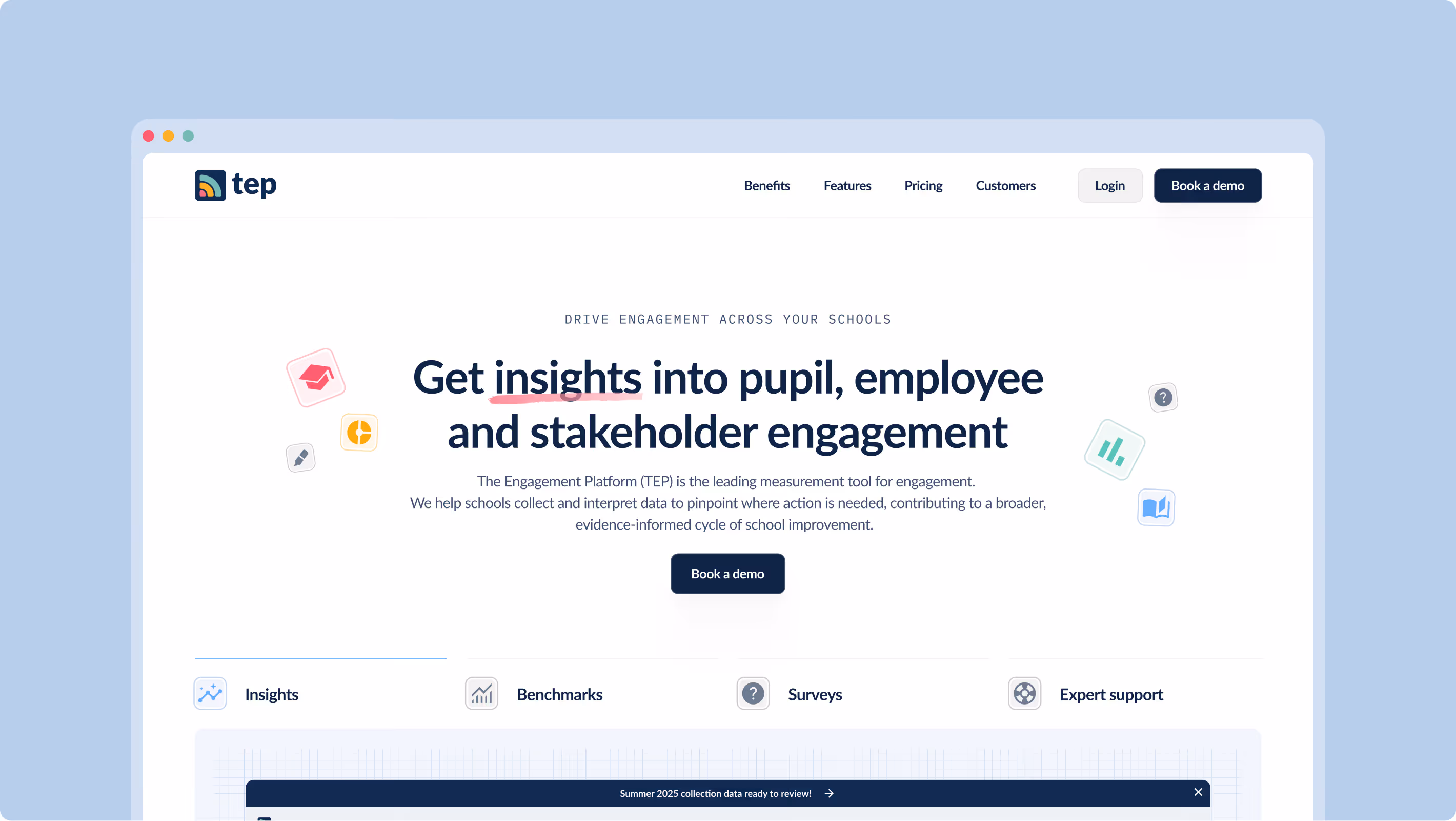
Following on from multiple collaborations with the TEP team, they came to us to transform their three-page website into a fully-fledged marketing tool. Looking to unify the design language of their site and brand assets with that of parent-company ImpactEd, we set out an art direction that strikes a balance between TEP’s playful history and the seriousness of their mission.
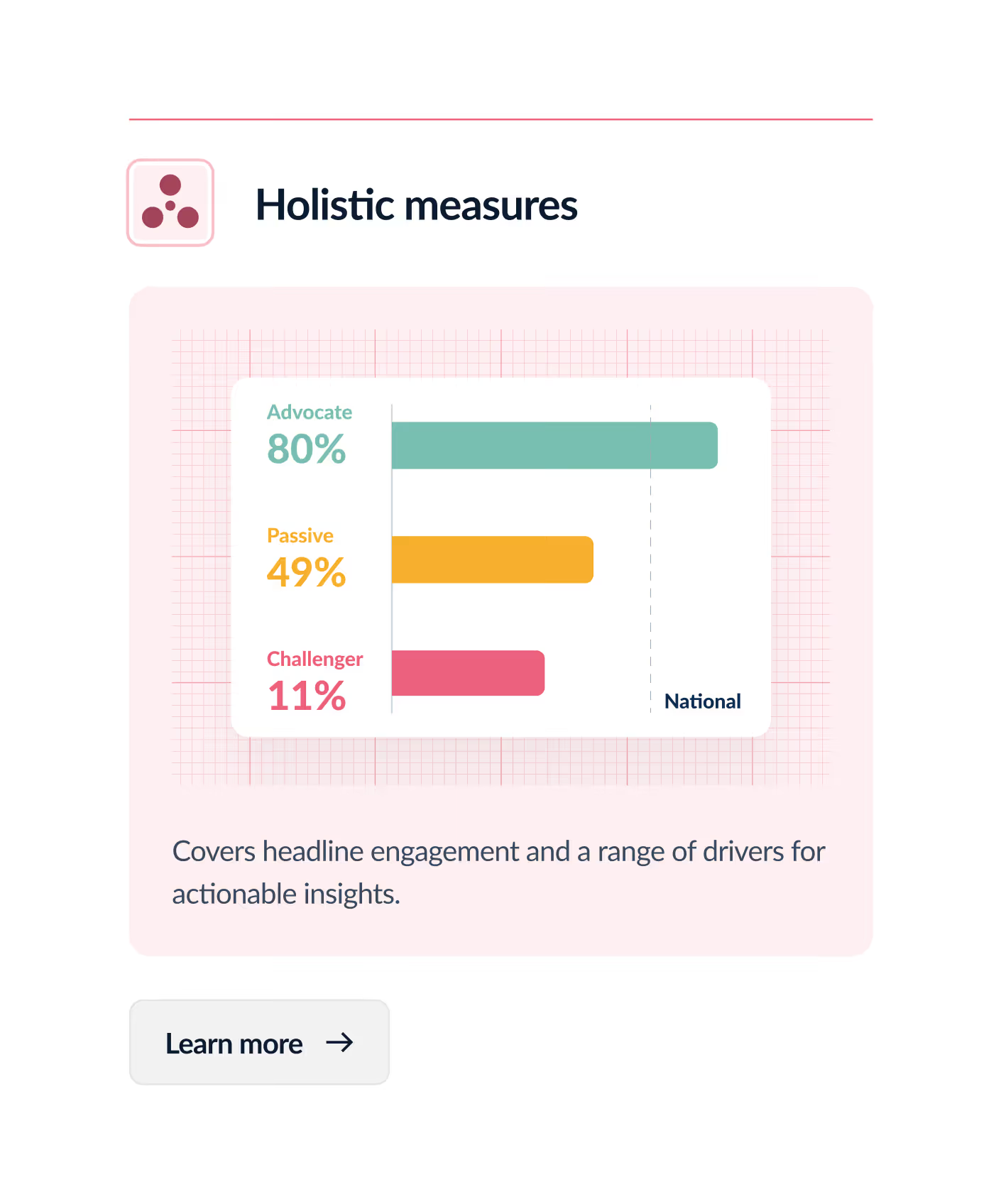
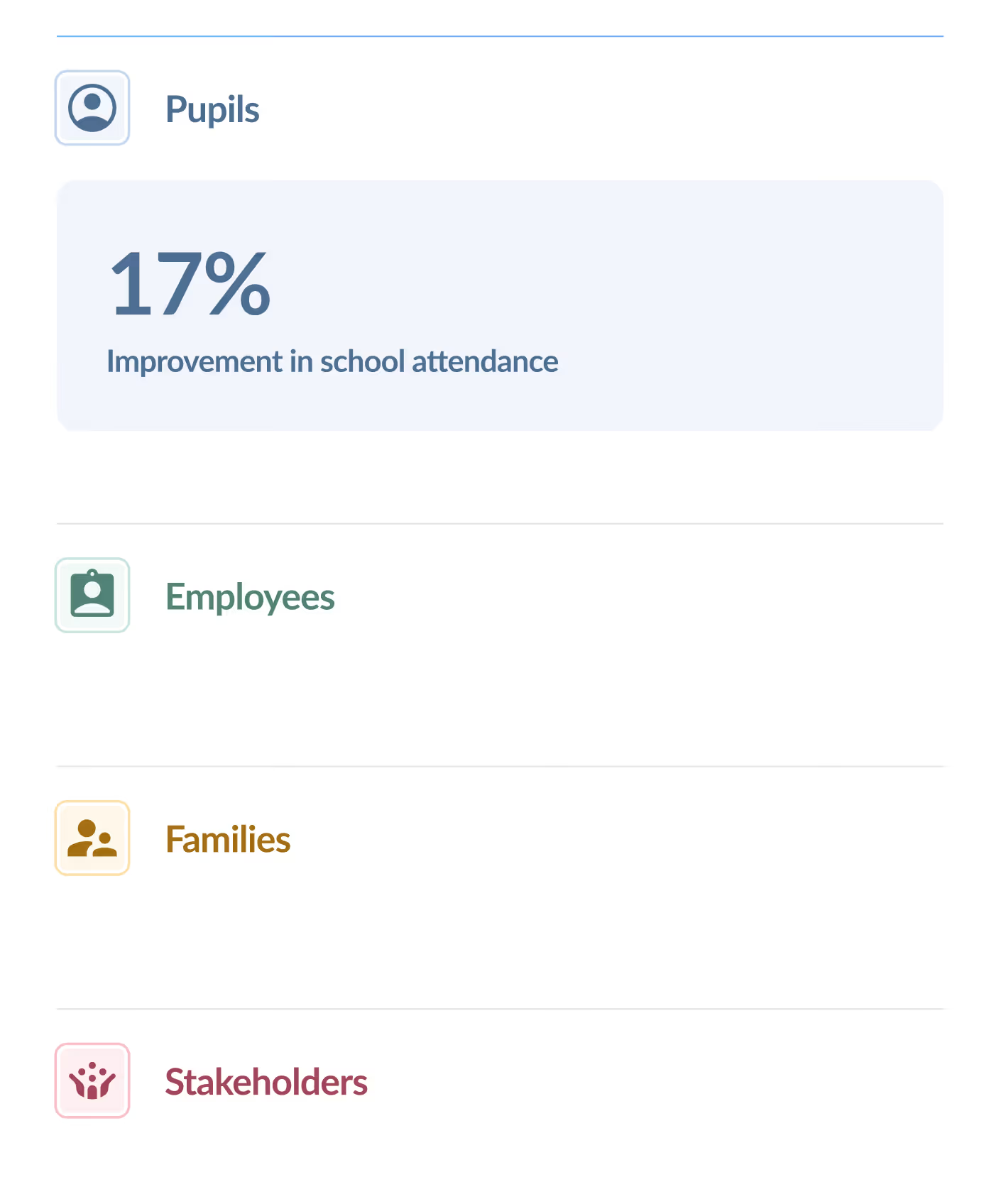
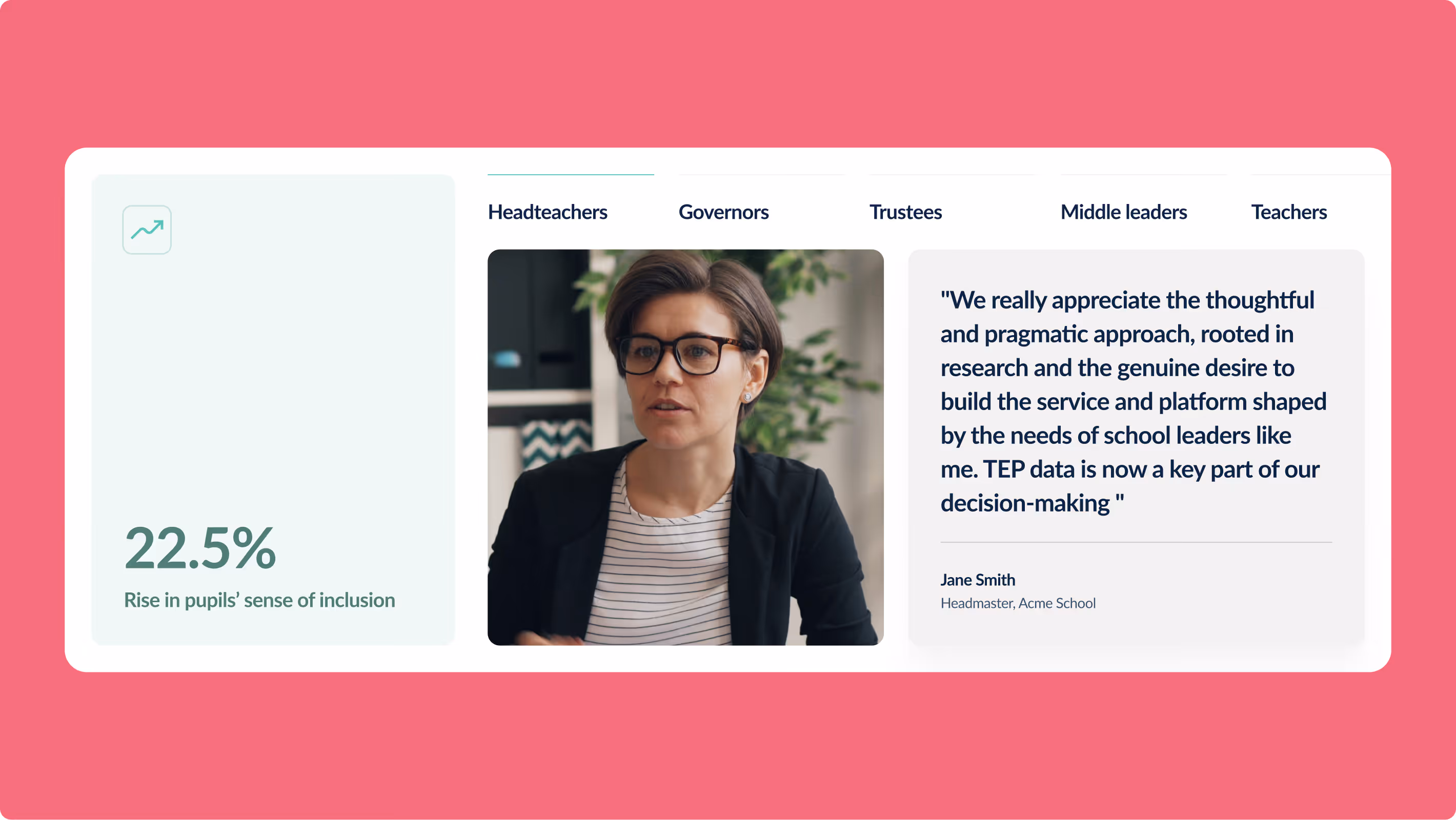
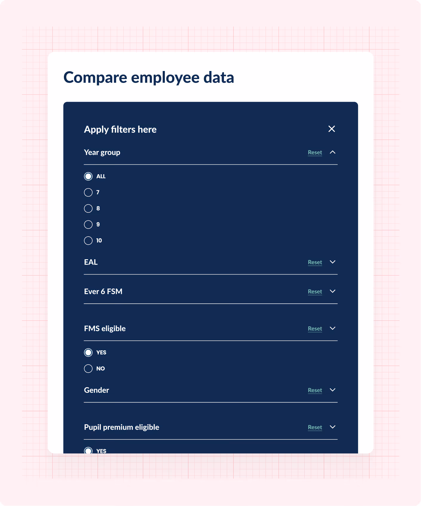
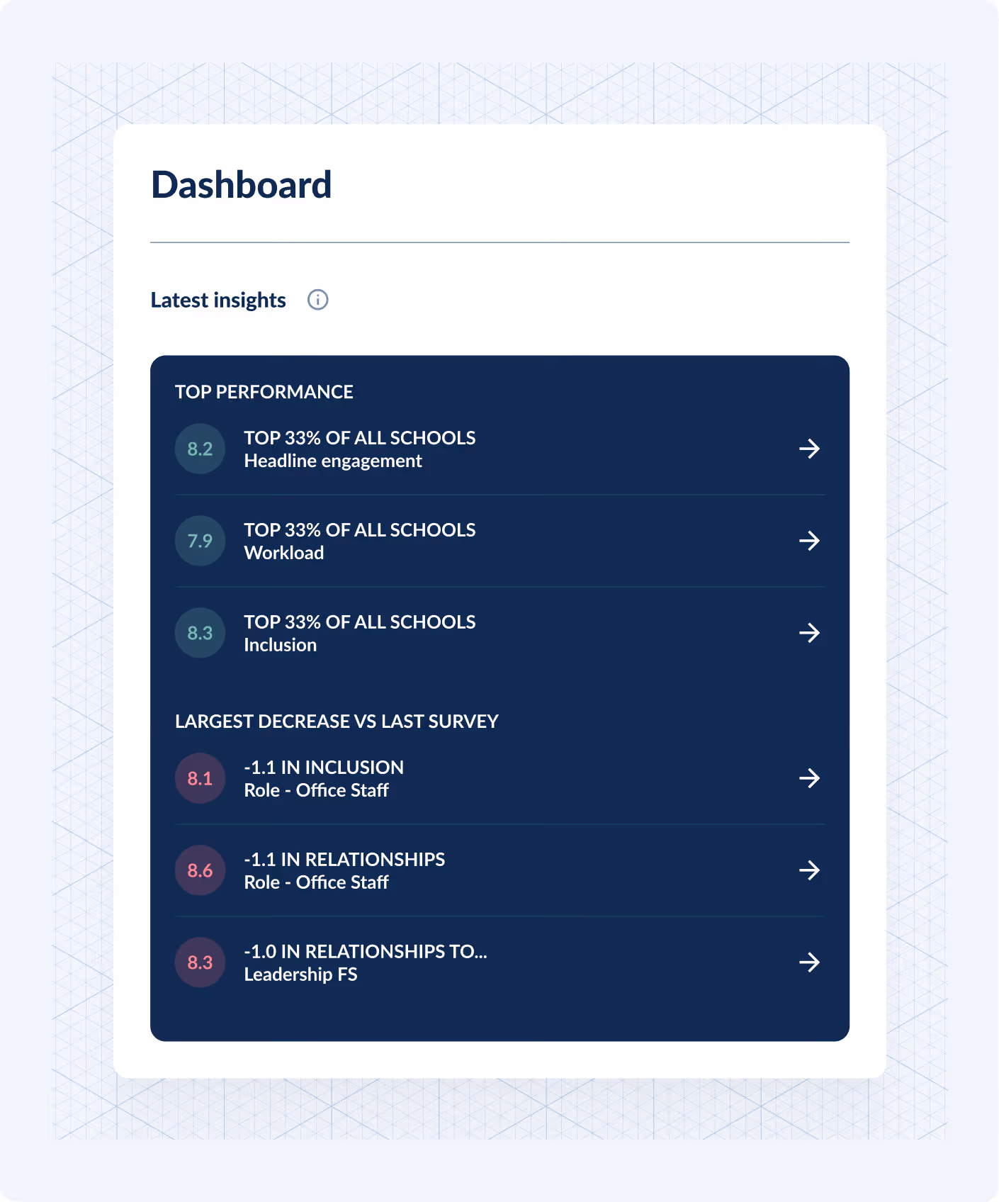
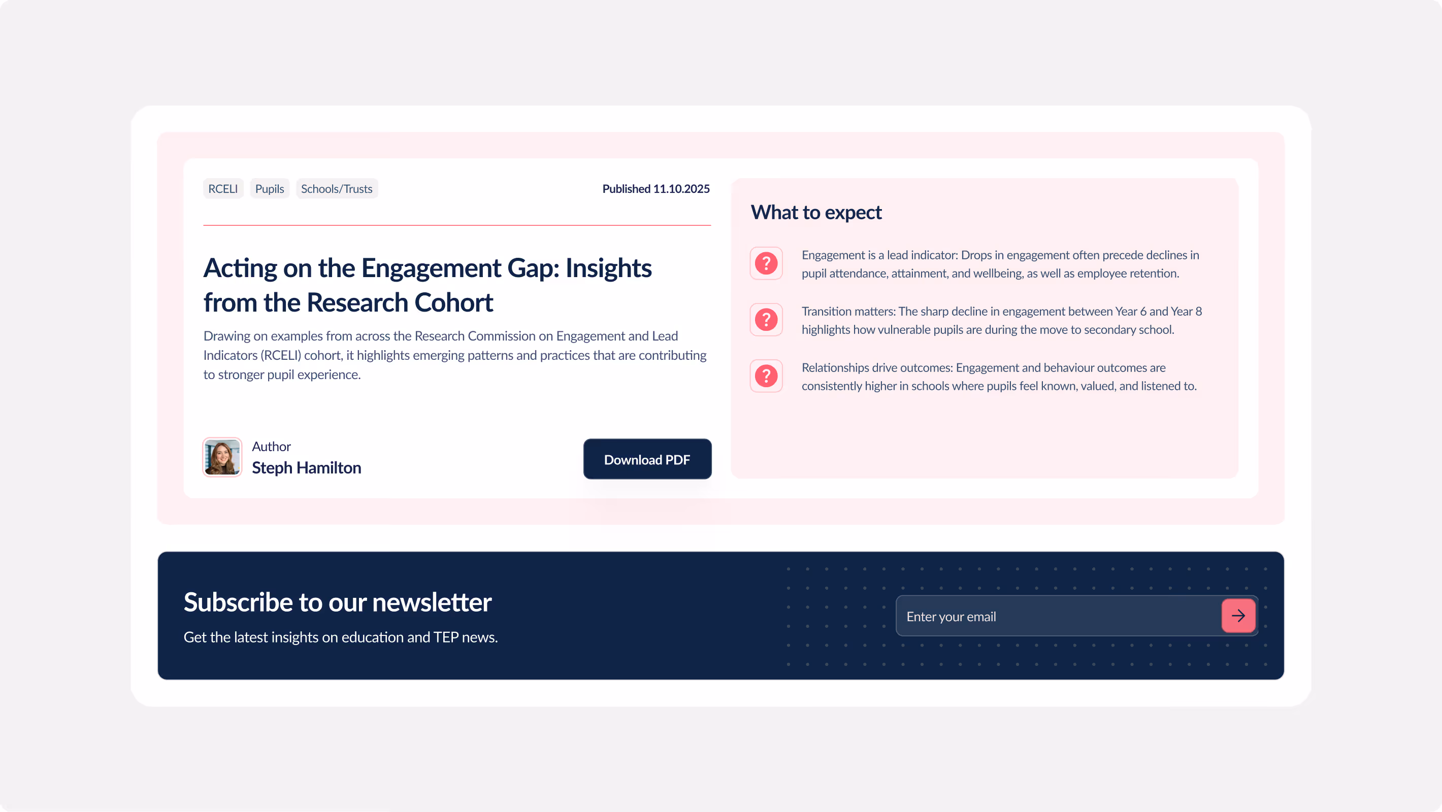
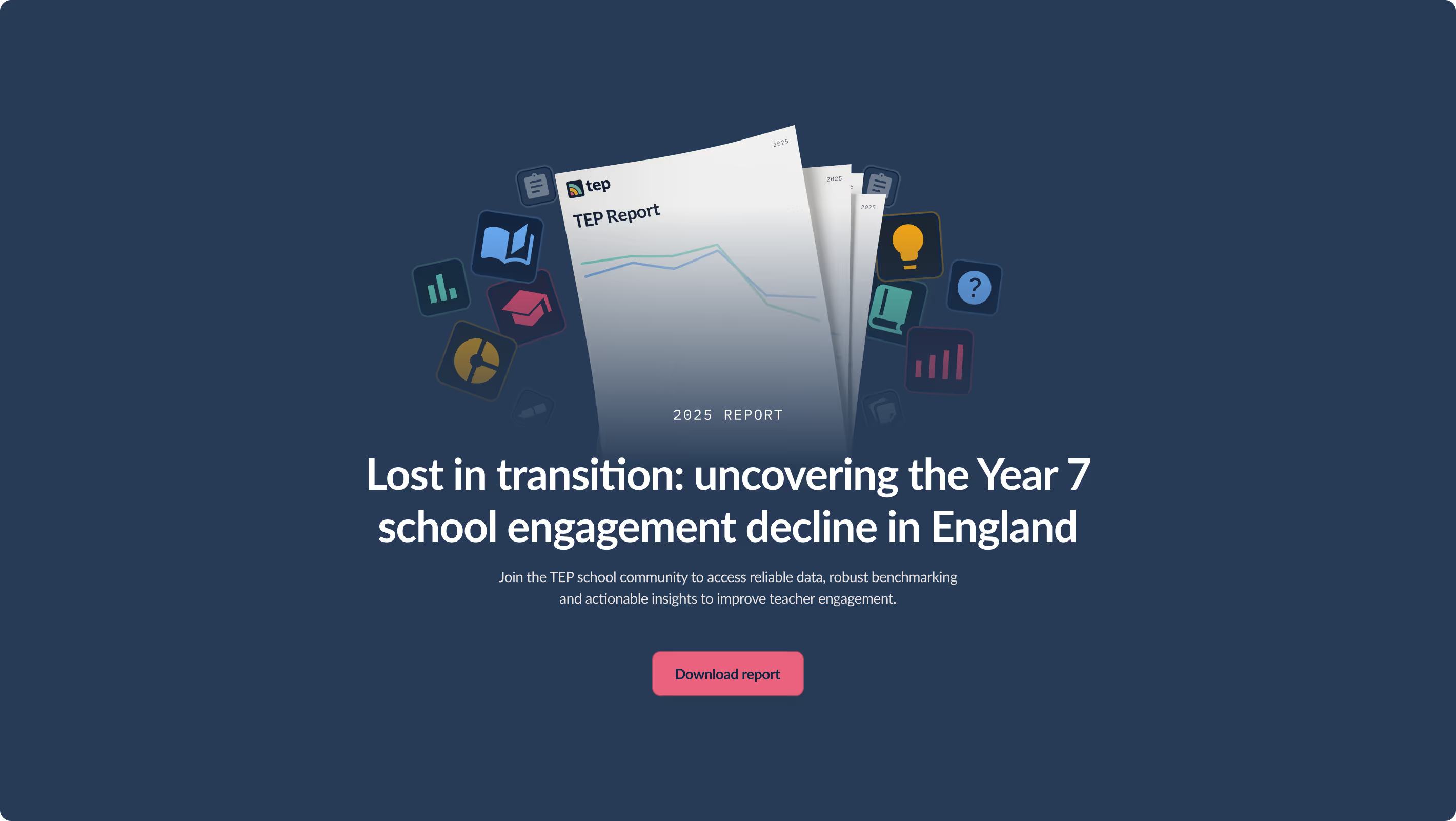
Working with TEP’s marketing team, we set out a site structure that allowed them to champion their new platform with contextual graphics that put complex data into a context that made sense to users. Whilst the UI leant into the design style of parent company ImpactEd, a vibrant colour palette and graphic set gave TEP its own playful identity.
A new resource CMS also gave the TEP team space to curate and host their own content. We made use of Webflow’s editor tools to create a system that the whole marketing team could use with ease. A live, Figma-based brand document gives marketeers the tools they need to roll out the new visual identity across their marketing materials, from slide decks to socials.


Really fantastic team to work with. Thorough set up and expectation setting which made the project run smoothly. Feedback was received really well and it was always clear to me what we could be flexible on and they were able to come up with creative solutions to some of the trickier ideas to implement. Would work with them again in a shot.


More work
Explore future-facing projects and story-driven design with purpose-first brands.