Why SaaS Websites Look The Same & How To Break the Mold
Discover why SaaS websites all look alike and learn simple design, copy, and branding tweaks to make yours stand out. Read today.

Yes, your SaaS site might be “pretty,” but if it looks like every other Stripe‑meets‑Linear clone, it is quietly killing your differentiation and attracting generic, low‑fit traffic from most SaaS companies following the same template.
With the rise of minimalist, vibe-coded websites, most SaaS websites share a narrow set of visual and UX patterns, which makes them easy to recognise but hard to remember, especially when every SaaS product leans on the same key design elements and plain black background images.
The good news: with a few top-level changes to structure, copy, and visuals, you can keep the conversion‑friendly patterns that power many high-converting SaaS websites and still build a brand that your best customers actually remember.
By deliberately pushing branding, layout, and microcopy beyond these defaults, a SaaS company can stand out without sacrificing clarity, a clear value proposition, or conversion.
The visual monoculture of SaaS
SaaS websites commonly rely on minimalist layouts, dark-themed or neon gradients, geometric logos, and clean sans serif type, which creates a predictable visual identity across tools and categories. Repeated patterns such as centered hero sections, dashboard mockups on dark backgrounds, and generic three-word taglines (for example, “Build. Ship. Scale.” as noted by one Reddit user) reinforces this visual monoculture.
Core traits of the “SaaS look” include:
- Dark-theme background with minimalist white text.
- Simple grid layout with large hero, short sections, and little visual noise.
- Abstract geometric or letterform logos, often with linear gradients.
- Product UI mockups floating on soft gradients or dark panels.
- Vague benefit-led headlines and concise, low‑personality copy.
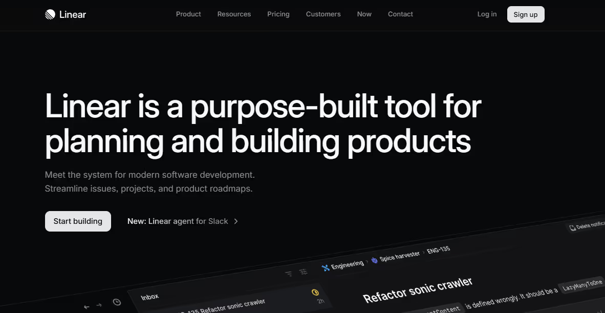
Stripe’s clean grids, dark panels, and confident typography helped normalise this “premium minimal” model, especially for B2B and fintech. Linear “set a trend” for dark minimal SaaS websites, and you can browse Linear-tagged landing pages that all share this same style.
In fact, designers over on Reddit explicitly call out Linear’s dark, ultra-minimal aesthetic as a template that many newer SaaS sites copy, often down to dark backgrounds, purple accents, and sharp typography.
Why homogeneity became the norm for SaaS sites
Design trends drive visual similarity because teams copy what appears to work, and Stripe- or Linear-like layouts have become a default success pattern. As more competitors reuse these cues, they train users to associate that look with “modern SaaS,” which encourages further imitation.
One Reddit user notes: “I thought they looked the same [because it is] the standard for a SaaS. Like if you don't do it, you're not following the industry standard, which will hurt your brand.” Another states: “They look identical because most of them are vibe-coded or made using the same free template, not by web designers.”
Industry thought-leaders think along similar lines, with design founder Dave Benton stating a simple reasoning behind the cookie-cutter designs over on LinkedIn: “90% of enterprise websites look identical because it works.”
However, most SaaS companies miss the mark. Why? Benton goes on to state: “They make everything standard, building digital clones where only the logo changes. The smart approach takes more skill: keep the backbone standard while making your unique elements shine.”
Additional industry voices like Rukaiya Sneha warn that the lack of creativity in SaaS design can also harm conversions. She states: “You don’t need to look trendy. You need to be memorable.”
So, why do all SaaS websites look the same?
In reality, several structural factors push brands toward the same layouts:
- Common UI libraries and templates: Components from Tailwind kits, Bootstrap-based themes, and prebuilt SaaS templates are widely used, especially in early-stage products.
- No‑code and AI builders: Website builders that optimise for speed rely on a small set of high-performing sections, so many products ship with virtually identical structures.
- A/B tested patterns: Standard hero + social proof + features + pricing flows are known to convert for SaaS and get reused instead of reimagined.
- MVP pressure: Teams racing to launch an MVP prioritise shipping something “good enough” over investing in brand-specific visuals.
Following familiar layouts is rarely an accident; many teams intentionally mimic successful brands because it feels safer and faster than defining a distinct identity. There are real benefits: recognisable patterns reduce cognitive load, support trust, and make it easier for visitors to navigate pricing, integration docs, and sign-up flows.
Pitfalls of “safe” SaaS design
Homogeneous design weakens brand differentiation, because when products share the same visual language, buyers struggle to recall which tool offered which promise. Designers and agencies increasingly criticise “copy‑paste minimalism” as pleasant but bland, arguing that it makes even strong products feel interchangeable.
This approach affects user experience and perceived value in several ways:
- Users remember functional flows but forget which brand delivered them if everything looks and sounds the same.
- Overly generic visuals can undercut premium pricing or complex capabilities, because the site fails to communicate a specific story or point of view.
- “Safe” design can erode emotional connection, especially in markets where buyers expect tools to reflect their culture or domain in a more authentic way.
Users may tolerate sameness when they just need to accomplish a task, but in crowded categories this sameness makes it much harder to win recall, referrals, and word‑of‑mouth.
How to break the mold (with inspo)
Unique branding creates market differentiation when it translates product truth into a distinct visual and verbal system rather than random decoration. The goal is not to reject conventions altogether, but to bend them to fit your story.
Use these principles to stand out:
Audit your value and visual story
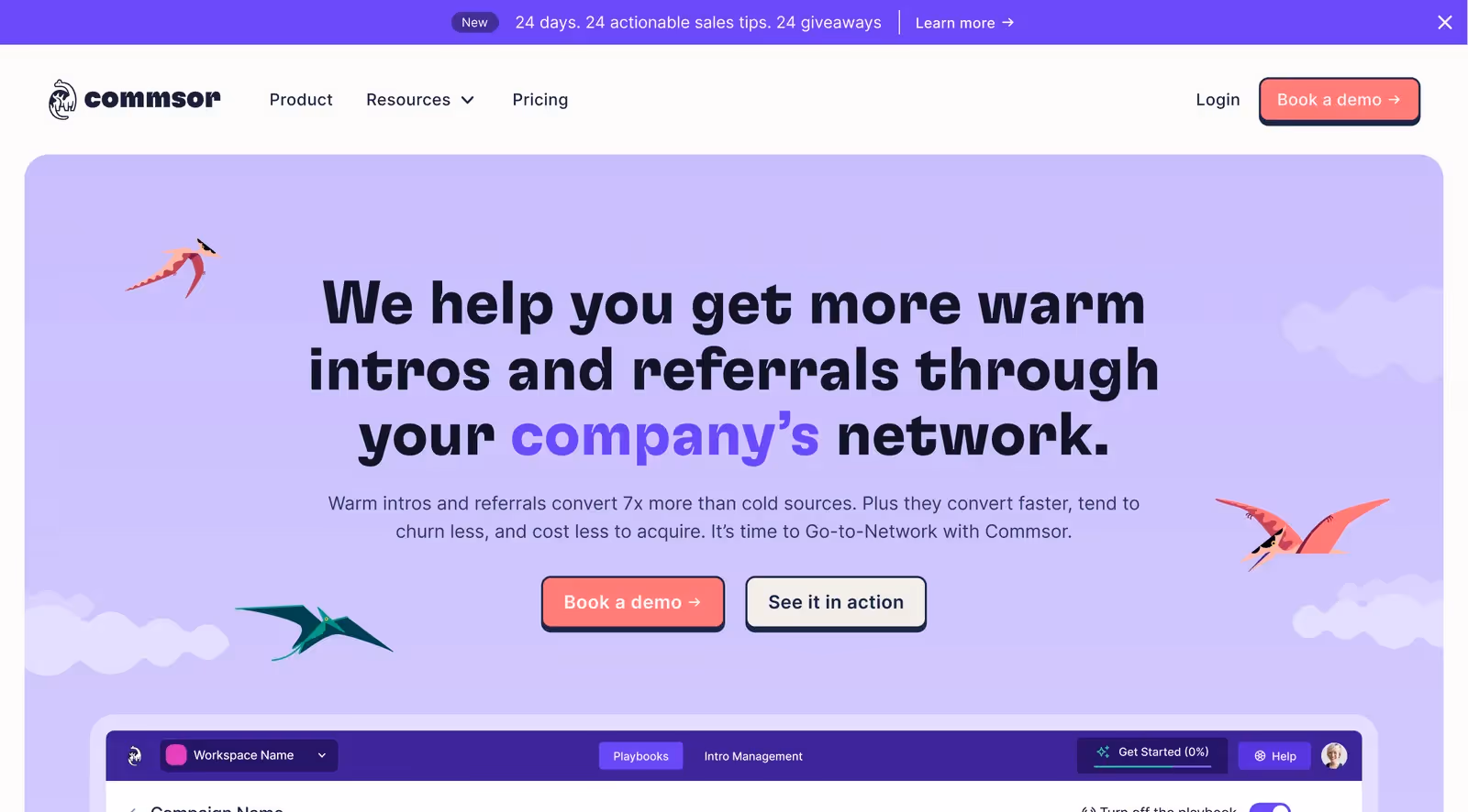
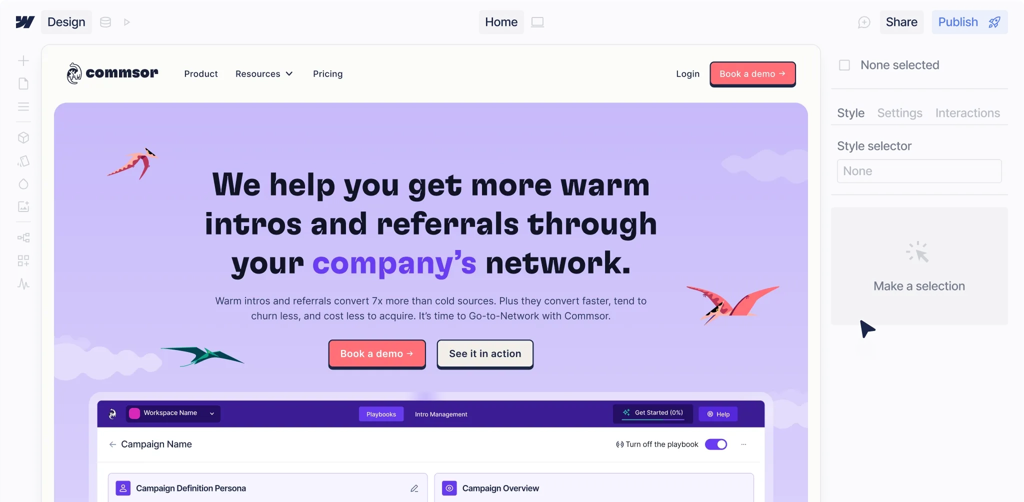
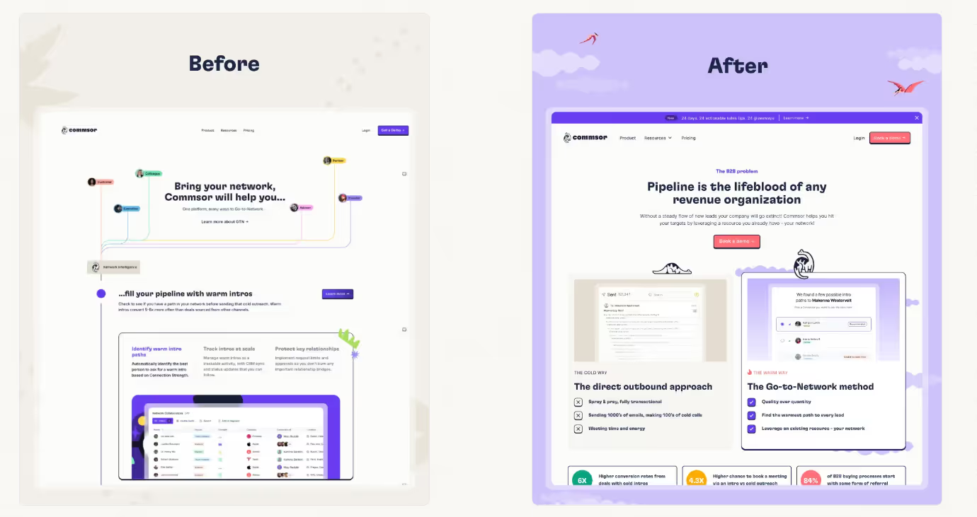
Here you can see a hero section that clearly ties its value and visual story together by promising more warm intros and referrals, then backing that up with friendly, playful design choices: a soft purple backdrop, rounded UI, bright CTAs, and bird illustrations that all reinforce a human, network‑driven, “warm” sales experience instead of cold, transactional outreach.
To achieve this:
- Identify the 1 to 3 specific outcomes or attitudes that define your product (for example, calm automation, playful collaboration, ultra-precision).
- Map how those themes might influence colour, imagery, and typography so the brand “feels” like the product experience.
Go beyond trends with assets that only you can own
- Use product‑specific UI scenes, real customer environments, or commissioned illustrations instead of generic 3D blobs or stock dashboards.
- Explore bolder layouts on secondary sections, such as staggered storytelling, scrollytelling product tours, or editorial-style feature pages.
Customise CTAs, interactions, and flows
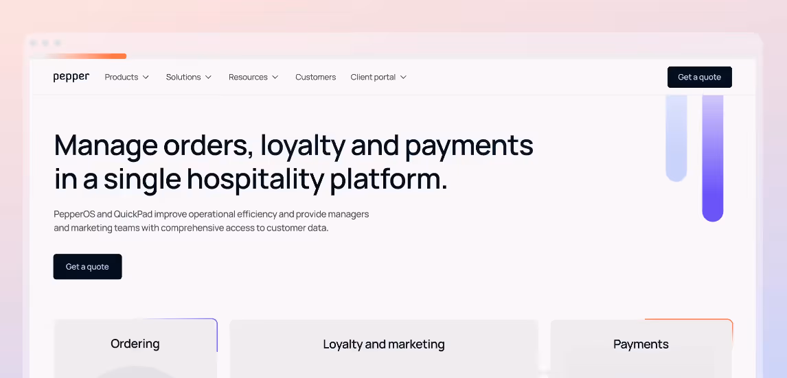
Here, you see a standard SaaS layout and navigation, but the details of the flow are tuned to how hospitality operators buy: the main CTA is a focused “Get a quote” rather than a generic “Get started,” and the three large cards beneath the hero are labeled around real jobs to be done such as ordering, loyalty and marketing, and payments, which nudges visitors to self‑select their path instead of scrolling through a generic feature list.
To achieve this:
- Keep navigation and basic hierarchy familiar, but vary CTA labels, empty states, and hover interactions to reflect your tone and value.
- Adjust the order and pacing of sections to match how your best customers think, not just the default hero > features > logos > pricing template.
Infuse microcopy and visuals with personality
- Write specific, concrete and compelling headlines and microcopy that speak to your audience’s context instead of generic “unlock potential” language.
- Use iconography, motion, and section labels that reference your domain, not just abstract SaaS jargon.
Balance convention with distinctiveness
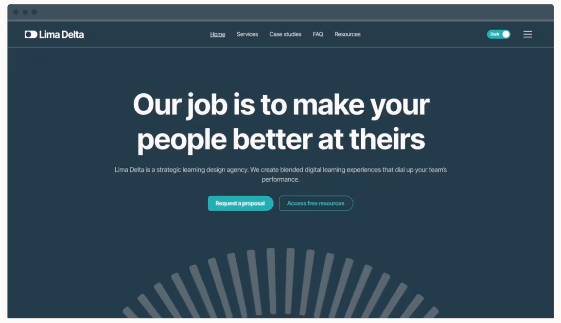
Lima Delta Brand & Website Redesign
In this example, you see a familiar frame that keeps all the conventional pieces in place: a standard top navigation, centered hero headline, and primary CTA buttons that feel instantly usable. The distinctiveness comes from the rich teal colour system, bold conversational headline (“Our job is to make your people better at theirs”), and the subtle radial graphic at the bottom, which together give the page a specific voice and story without breaking the underlying layout patterns your visitors expect.
To achieve this:
- Preserve standard elements such as top navigation, responsive grids, and clear pricing tables for usability.
- Push differentiation mainly through colour systems, typography choices, tone of voice, and storytelling structures.
Comparing distinct SaaS web brand approaches
The SaaS brands we explored in the previous sections show how to combine standard structures with distinctive expressions. They demonstrate that uniqueness does not require abandoning clarity.
Think forward with next-gen SaaS web design with Overpass Studio
Most SaaS teams do not need another generic “premium minimal” template; they need a site that translates their specific product story into a clear, memorable experience without sacrificing proven conversion flows.
Overpass Studio’s SaaS web design services are built exactly for that balance: strategy workshops, detailed information architecture, and product messaging frameworks ensure your homepage and key pages keep the familiar structure that converts, while reframing the narrative and visuals around what actually makes your product different.
If you are ready to move beyond “nice but forgettable” and turn your SaaS site into a conversion engine that buyers actually remember, there are two easy ways to start. For fast insight into where your current homepage blends into the crowd, Grab a Website Homepage Audit and get specific, founder‑ready recommendations to sharpen your story and structure.
For a deeper shift (from refreshed visuals to a full redesign, including strategy, design systems, and content) , book a call with Overpass Studio to explore whether a website refresh or full redesign is the right path for your next stage of growth.
FAQs
Is too much uniqueness risky for SaaS?
Too much uniqueness is risky when it breaks familiarity, clarity, or speed, not when it simply looks different. Research on SaaS UX stresses that users rely on predictable navigation, clear information hierarchy, and consistent patterns, and that confusing layouts, unusual interactions, or heavy visuals can quickly erode trust and crush conversions.
The safest approach is to keep core UX conventions stable (navigation, layout logic, readable copy, fast performance) while using originality in brand elements such as tone of voice, imagery, colour, and storytelling so the site feels distinctive without making it harder to understand or use.
Can strong UX and unique web branding coexist?
Yes, strong UX and unique web branding coexist when branding flexes around usability instead of fighting it. Research on SaaS and UX design shows that the best sites use familiar patterns such as clear navigation, consistent components, and readable layouts, then layer distinct colours, typography, motion, and storytelling on top so the product feels unmistakable without adding friction or confusion.
Why do so many modern SaaS websites share the same layout and visual style?
Many modern SaaS websites converge on the same layout and visual style because founders copy patterns from a small set of “successful” brands and inspiration galleries instead of their own positioning, which leads to repeated hero structures, dashboard mockups, and gradient-heavy palettes.
How do popular templates, no‑code tools, and design systems contribute to SaaS websites looking alike?
Templates, no‑code builders, and design systems amplify this: they ship with a handful of pre‑optimised SaaS layouts, components, and CTAs, so busy teams launch quickly by changing logos and colours rather than rethinking structure, which produces dozens of near‑identical sites across categories.
What are effective ways to make a SaaS website stand out visually in 2025 without lowering conversions?
To make a SaaS website stand out in 2026 without hurting conversions, keep proven UX conventions such as clear navigation, simple pricing, fast load times, and action‑driven CTAs, but differentiate through sharper positioning, specific problem‑led headlines, product‑true visuals, and tailored flows that mirror how your best customers evaluate and buy, instead of default hero > features > logos > pricing stacks.
Get in touch