Roundup: 8 Best SaaS Website Examples For 2026
8 high-converting SaaS websites for 2026. Real examples, UX patterns, and design takeaways to boost your conversion rates.

A great SaaS website does more than look pretty. It works hard. In 2026, the best SaaS website examples combine sharp positioning, ultra-clear UX, and polished visuals that actually help users understand the product faster and convert with less friction.
This roundup pulls together eight standout SaaS websites that nail that balance, so you can see how teams are using motion, messaging, and product storytelling to turn “nice site” into “where do I sign up?”.
Each example is broken down into practical takeaways you can steal for your own redesign, from navigation patterns and hero layouts to how they showcase complex products without overwhelming visitors. If you’re planning a full redesign or just hunting for fresh ideas, these sites offer a playbook for what “good” looks like in modern SaaS web design.
Concerned about conversions? Grab a free conversion audit
6 Best SaaS Website Design Examples For Inspo in 2026
Below, you will find eight SaaS landing page examples that set the bar for strategy, UX, and visual design in 2026, across different B2B SaaS sectors like logistics, fintech, BI, and edtech. For each one, you will see what makes it work, why it converts, and how you can adapt the same patterns for your own product.
Logistics tech: Parsel
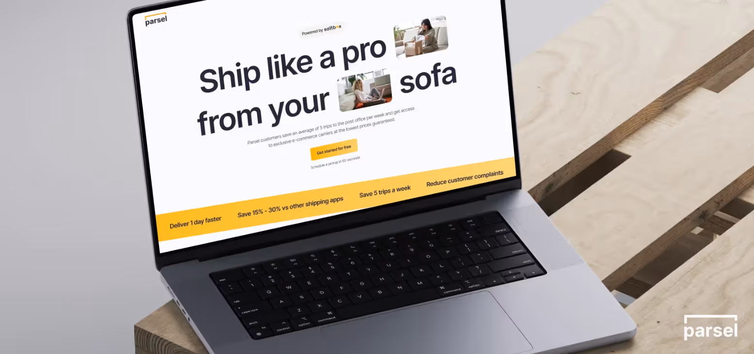
Parsel’s site leans into trust-building for complex logistics with clean layouts, confident typography, and a calm, muted palette that feels operational rather than flashy. The product UI is framed in real-world context (parcels, routes, workflows), helping visitors immediately connect screens to outcomes like faster delivery and fewer errors.
Key design points for inspiration:
- Use a restrained colour system and a bold, strong type hierarchy to signal reliability for mission‑critical tools.
- Show UI within real logistics scenarios (maps, schedules, tracking views) instead of floating screenshots.
- Keep hero copy short, direct and outcome-focused to clarify value quickly for time‑poor operations leaders.
Design and prototyping tech: Figma
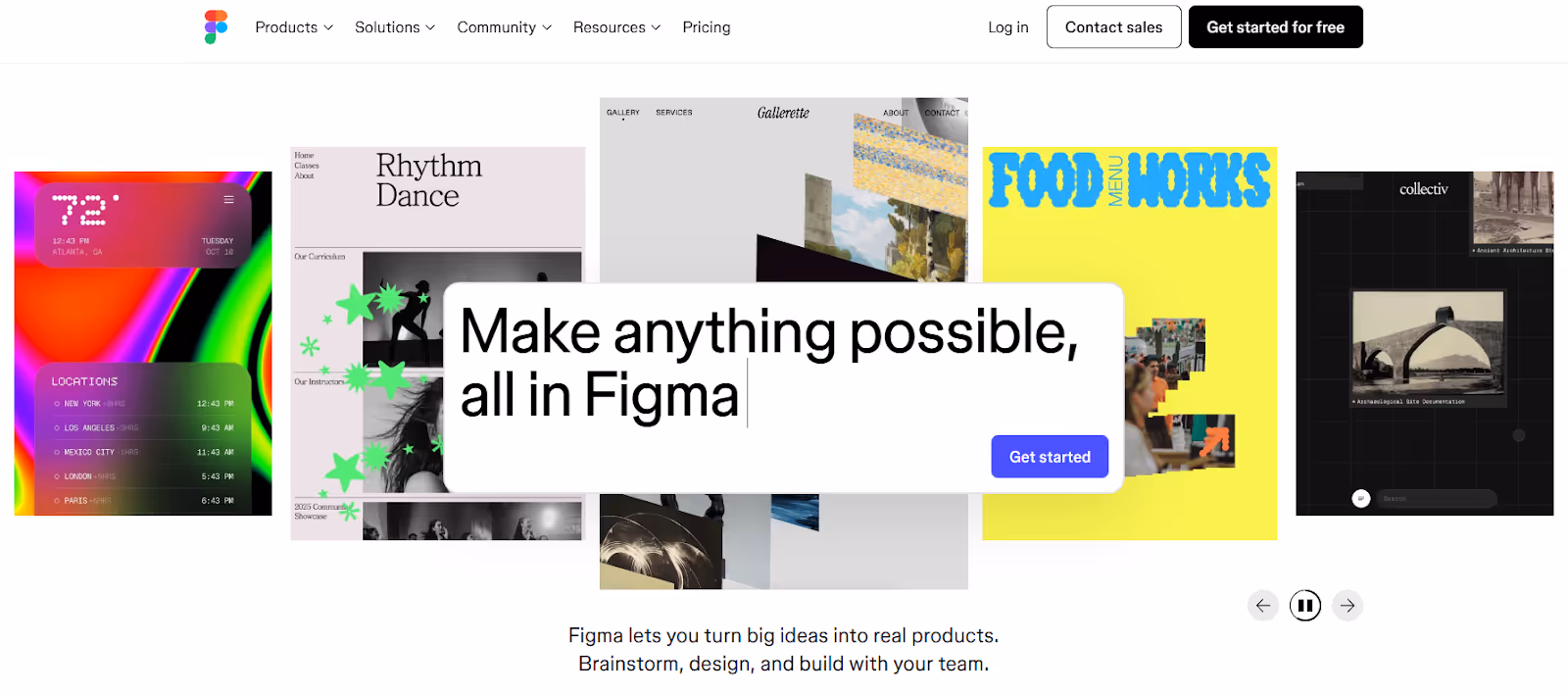
Figma uses collaborative cursors, live cursors in visuals, and interface mockups to show how teams work together in the product, with movement dialed up on overview pages and dialed down on deeper product pages for readability.
Key elements for inspiration:
- Visually dramatise collaboration with live cursors, overlapping avatars, and shared canvases.
- Reserve heavier animation for high-level storytelling and keep detailed product pages calmer for readability.
- Tie navigation and illustrations to product use cases so every visual reinforces how teams actually work.
Task management tech: Asana
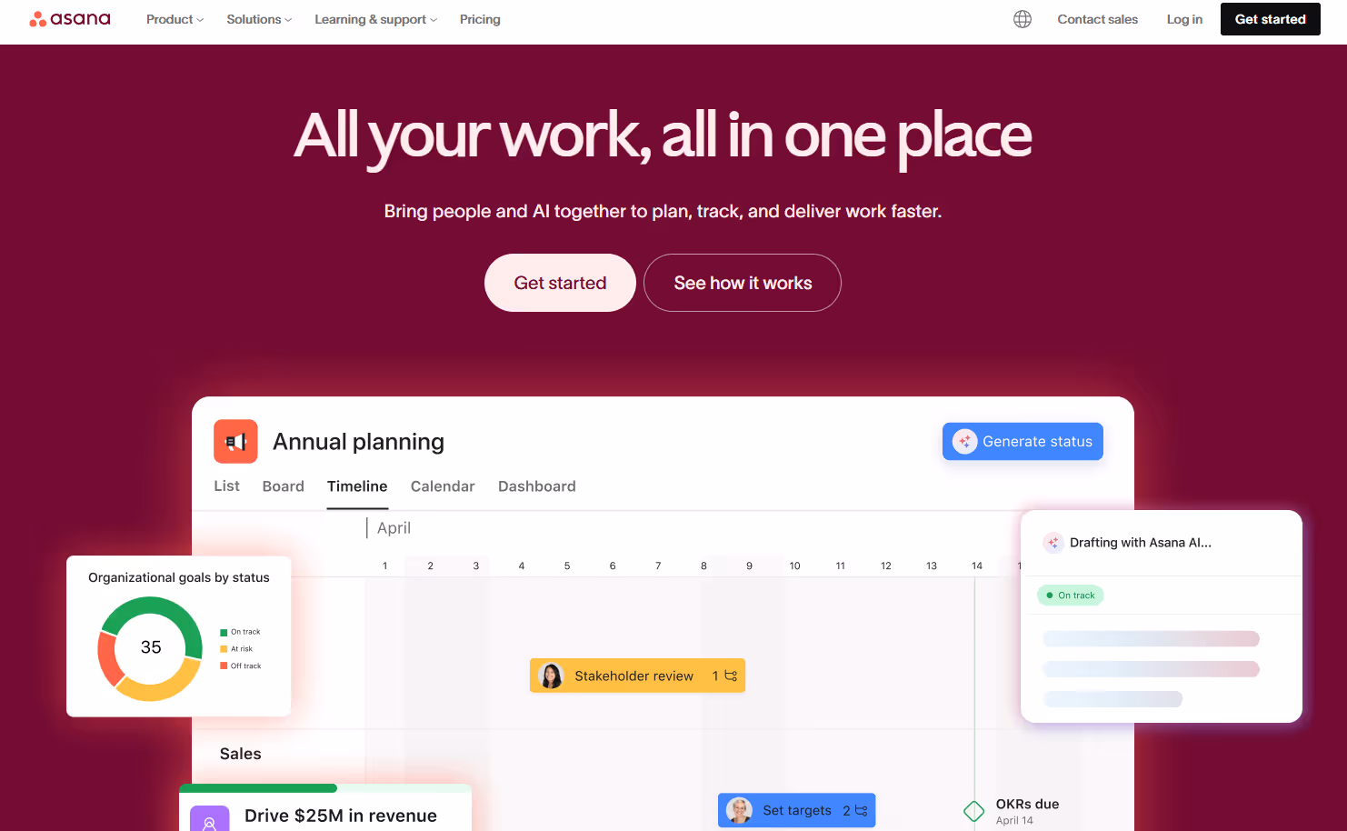
Asana prioritises clarity over spectacle, with highly legible typography, generous white space, and minimal motion so visitors can digest messaging without distraction. The navigation is large but carefully structured, enabling self‑serve education across use cases, industries, and templates without forcing a conversation with sales.
Key elements for inspiration:
- Use ample white space and simple colour blocking to make dense information feel approachable.
- Keep animation subtle and purposeful so it supports understanding rather than competing with copy.
- Invest in a well-organised mega‑nav that routes different personas into tailored paths and resources.
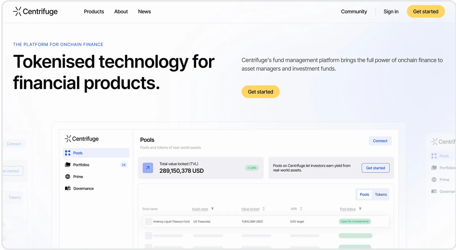
Fintech: Centrifuge
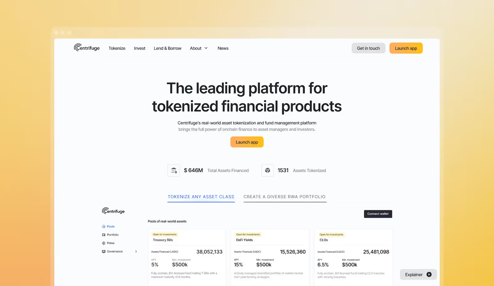
Centrifuge presents complex financial infrastructure with a confident, modern visual language: dark backgrounds, precise type, and clear diagrams of flows between assets, investors, and protocols. Metrics and case‑study proof points appear early, helping skeptical buyers quickly understand credibility, scale, and risk posture.
Key design points for inspiration:
- Use diagrams and flow visuals to explain abstract financial mechanics in one glance.
- Pair bold visuals with concise headlines and proof (APY ranges, TVL, customer logos) to build trust fast.
- Keep motion subtle and systematic so a serious financial brand still feels cutting‑edge, not playful.
Fintech: Ramp
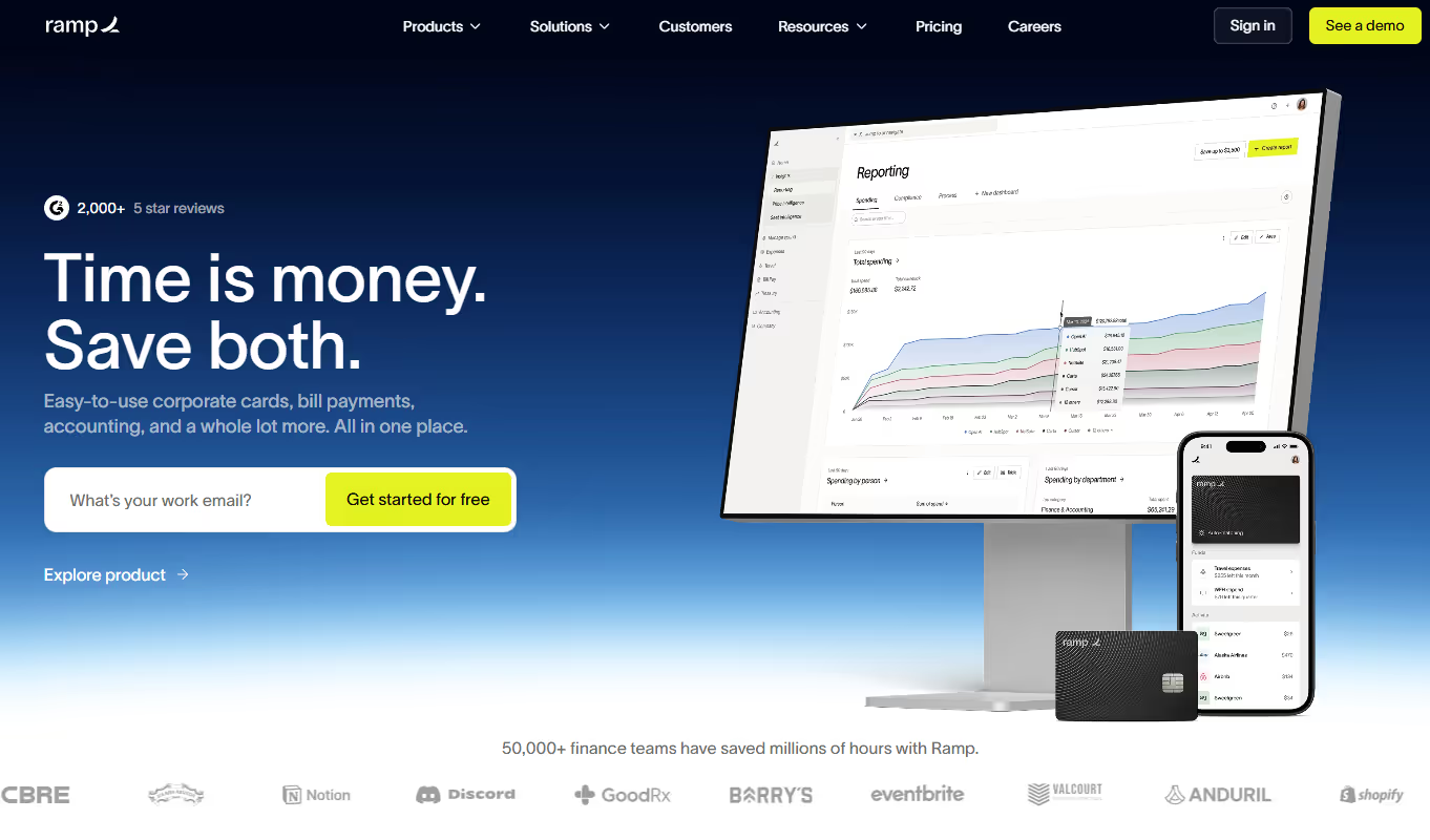
Ramp uses subtle motion, strong typography, and careful spacing to create a polished but unfussy financial brand that feels both premium and trustworthy. Interactions add tactility—cards sliding, balances updating—without overwhelming the layout, while structured sections make it easy to understand cards, spend controls, and automation at a glance.
Key elements for inspiration:
- Combine high‑contrast type with disciplined spacing to convey confidence and financial rigor.
- Use small, tactile interactions on cards and UI modules to make the product feel tangible.
- Organise pages into clear narrative blocks (problem, product, proof) so evaluators can skim and still understand the story.
Edutech: TEP (Teacher Engagement Platform)
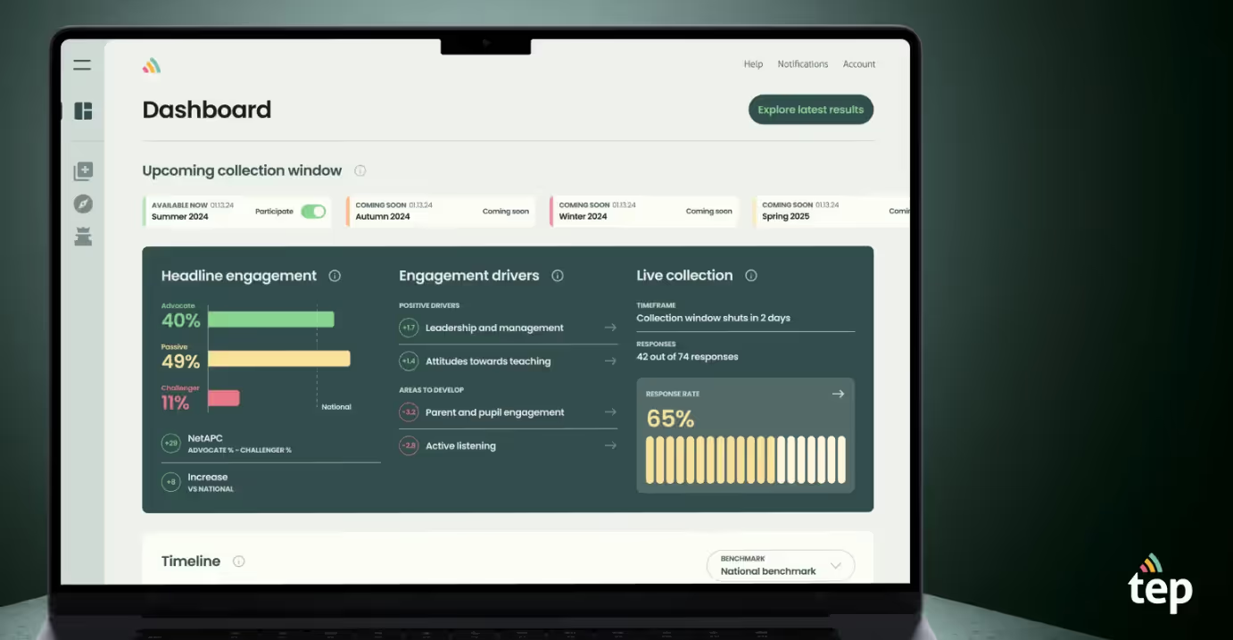
Teacher Engagement Platform (TEP) employs the largest standardised question set to understand school staff and teacher engagement and its underlying drivers. It's managed, reported, and benchmarked via a user-friendly digital platform.
The design balances professional credibility with approachability through soft colour palettes, clear data visualisation, and intuitive navigation that makes benchmarking and reporting feel manageable rather than overwhelming.
Key design points for inspiration:
- Use accessible visual hierarchy and gentle colours to make data-dense educational tools feel approachable for non-technical school leaders.
- Frame complex metrics within familiar school contexts (staff surveys, engagement drivers, benchmarks) so administrators immediately understand how data connects to school improvement outcomes.
- Prioritise clarity in dashboards and reporting views with clean layouts and straightforward navigation that let leadership teams self-serve insights without technical training.
- Design for fast comprehension with concise interface copy and visual summaries that respect how time-pressed educational leaders need to digest information quickly.
What makes a “great” SaaS website (common traits)
All of these steps are critical to our B2B SaaS web design services. From strategy and IA to UI design, content, and dev prep, the process is designed to take you from fuzzy brief to launch-ready site with clarity at every stage.
Get your web conversion audit
The secret sauce behind the best SaaS web design
The secret sauce behind these real landing page examples is partnering with a team that engineers your website as a high-performance revenue engine: built to qualify, nurture, and close, not just sit there and look pretty.
That means deep discovery with sales and marketing, ruthless clarity on ICP and positioning, and page flows built around how real deals actually move from “curious” to “close.” It is also about sweating the details: navigation that mirrors your sales process, messaging that handles objections before a demo, and UI that showcases your product in the exact moments a champion needs to sell it internally.
Luckily, all of that is exactly what this team is built to do. We can’t wait to hear from you.
Like our work? Book a call
Best SaaS Landing Page Examples FAQs
What key elements make a great SaaS landing page?
A great SaaS landing page design starts with a clear value proposition that quickly explains what the product does, who the target audience is, and why it matters. It should guide website visitors with intuitive UX, focused messaging, and visuals that support user engagement rather than distract from it, so people can understand the value proposition and take the next step with confidence.
Which SaaS websites have the best conversion-focused homepages?
The strongest conversion-focused homepages approach the page from a marketing perspective, using outcome-led hero copy, transparent pricing links, and clear pathways into demos or trials. They connect positioning to the target audience, surface proof like customer testimonials early, and make it easy to move from curiosity to action without hunting for information.
What are examples of SaaS sites with outstanding product demos?
Websites like Figma and other top SaaS products shine by weaving product demos directly into their SaaS landing page design, using real-world scenarios and UI flows to reduce guesswork. These demos help website visitors see how features map to outcomes, which boosts user engagement and supports a stronger overall value proposition.
Which SaaS websites offer minimalistic design inspiration?
Asana and similar brands offer minimalistic inspiration by pairing clean layouts with a clear value proposition and restrained motion so content stays easy to scan. Their pages often include a focused pricing page, and social proof like customer testimonials without clutter, proving you do not need a detailed comparison table on the homepage itself to communicate value effectively.
How should a SaaS pricing page be structured?
A strong SaaS pricing page uses transparent pricing, concise plan descriptions, and, where relevant, a detailed comparison table to clarify what is included at each tier. It should speak directly to the target audience’s needs, reduce confusion or hidden surprises, and support user engagement by making it simple to pick the right plan and move forward.
How important is mobile optimisation for SaaS landing pages?
Mobile optimisation is critical for turning interested visitors into signups, because many decision-makers first encounter a SaaS landing page on their phones before revisiting on desktop to deepen evaluation. Aligning layout, navigation, and CTAs to work flawlessly on smaller screens ensures your marketing message, value proposition, and key proof points stay clear, making the best SaaS landing page designs feel credible and ready for a serious design project.
Get in touch