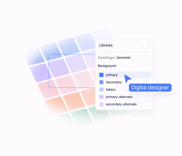
Using colour to create a strong brand identity
How colours make us feel has both biological and sociological origins. But for now, you must only ask yourself one question, how do different colours make me feel?

“In visual perception a colour is almost never seen as it really is - as it physically is. This fact makes colour the most relative medium in art.” - Josef Albers
You need only look at our use of language to see the role colours play in our lives. “A golden opportunity”, “a red-herring” or “it came out of the blue”. Good design roots itself in the knowledge that colour is not only descriptive but symbolic too. It understands that gold, alongside being the shiny thing medals are made of, can imply positivity, quality or wealth and that red can suggest caution or danger.
Designers look to identify the colour schemes that guide audiences to feel a certain way, often before they even know what they’re looking at. In this article, we’re looking at the two main schools of thought around colour. One concerns itself with the way in which colours play with our feelings whilst the other looks to understand how colours interact when placed together. It’s head versus heart, it’s logic versus feelings.
We’ll use both to select palettes that enhance your brand visuals and draw an audience into your story.
What do you want people to feel? (Colour Psychology)
The ways in which colours make us feel have both biological and sociological origins. With each new experience, we begin to form new ideas about the colours around us and what they mean. It’s important to note then, that colours are situational - that is to say, our reactions to them are determined by the context in which we see them.
Red can mean love in one context, but danger in another. Blue can elicit serenity, promote trust or induce sadness. Before asking what colours your brand should use, it’s important to identify which context you are presenting them in and what you’d like an audience to feel.
While there aren’t hard and fast rules, here’s a useful guide to some of the more common associations. Keeping these in mind when looking at your palette of choice is a good first port of call. If you’re offering ‘rewilding experiences’, you could look to an earthy calming colour palette. Or possibly you run a challenger tech startup and should look for punchy vibrant colours.
Which colours work together? (Colour Science)
You might have never heard of colour science, but that doesn’t mean you haven’t used it. For example - “Hey, does this shirt go with these jeans?”.
With the obvious caveat that you should always avoid double denim, here’s how to use a simple tool to ensure that your outfit - or your new brand - has colours that work well together.
Emerging in the 18th century, the colour wheel was created to give us an idea of how colours sit in reference to one another. We could dive down a rabbit hole of details and options but today we’ll stick to the three main combinations you should be aware of.
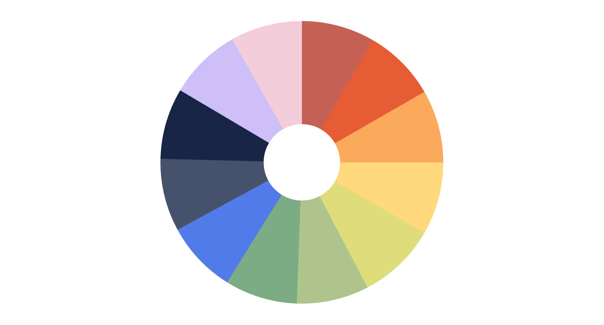
Complimentary colours always sit opposite each other on the colour wheel and stand out when used together. It’s why hundreds of blockbuster movies use a teal and orange colour grade to make different scenes pop. We recommend using one of the colours to accent the other, whether that’s the button on a website or the logo on a jacket - just be careful not to overdo it!
Triadic colours are equally spaced around the colour wheel and work well when you want vibrant and playful combinations that also work harmoniously - think superman's costume.
Analogous colours are the colours next to each other on the wheel. They’re less bold and you should reach for these combinations if you’re looking to create a uniform brand that is calm and aesthetically pleasing.
We’d recommend having a play with different colour palettes using Adobe's free tool.
Blue is blue, or is it?
Colours, for lack of a better phrase, aren’t black and white. In fact, if you look at the spectrum of light, white is a combination of all colours, and black is a total absence of colour. Facebook’s blue isn’t the same as Twitter’s blue and McDonald’s red is quite different from Coca-Cola’s. We don’t have bespoke words for every shade of every colour and thank goodness - ‘50 shades of grey’ wouldn’t have had a very catchy title if we did.
Once you’ve determined which colours might create the emotions you’d like people to feel, it’s time to consider which “versions” of those colours you would use. Would you like them to be vibrant or muted? Would you prefer brighter or darker shades? Could your blue move slightly more towards green?
Our newsletter, for example, has the colour code #F2F4FF - that's a very desaturated, light shade of bluey-purple. But we’d suggest leaving the technical lingo to the designers. Again the most important thing for you to consider is how it makes you feel.
Keep playing around here.
How do your favourite brands use colour?
Before diving into the pencil case and going crazy with the crayons, look at some of your favourite brands and consider their use of colour. What combinations have they used? Are their colours energetic or calm? Ask yourself: how do they make me feel?
We all safely assume a red fizzy drink is Coke and a purple bar of chocolate is Cadbury’s. Apple’s professional products come in grey, silver and gold whilst their cheaper alternatives come in fun vibrant colours. And there’s that particular shade of yellow that’s unanimous with power tools and diggers. When you start to see how colours change your own thoughts, you’ll get a greater understanding of how you want to apply them yourself.
Our 4-step process to the perfect colour palette
- Identifying what you want people to feel. Is your brand energetic? Is it calm? Is it playful?
- Take this and apply your knowledge of colour psychology to find a primary colour which could make people feel this way.
- Using the colour wheel, find two other colours that work alongside your primary.
- Kick back with a cup of tea and admire your brilliant work.
Now you’ve got the fundamentals. Let’s get colourful. 🌈
Get in touch